
You're going to need some 'copper orange'


Play
Teal, that subtly thrilling amalgam of blue and green, might have been the trendiest colour of 2014, but it's time to make room in the wardrobe for something entirely different.
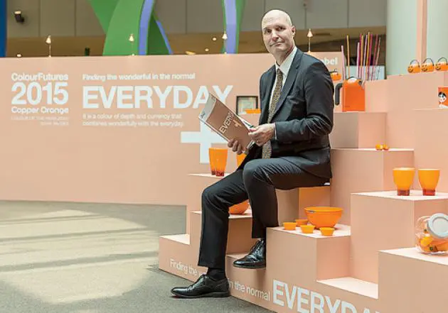
Paint maker AkzoNobel has declared that “copper orange” will be the hue that woos next year.
“It’s the colour of energy,” Jeremy Rowe, the firm’s managing director for Southeast and South Asia, explained at the World Architecture Festival.
It’s a “hot” colour that evokes tropical fruit and flowers, Eastern culture as seen in Buddhist monks’ robes and, in the West, autumn’s warm glow.
“From Stockholm to Shanghai, metallic colour tones are playing an increasingly important role in modern design,” Rowe said. “Replacing the cool blues and greens of yesteryear, a warmer spectrum of pinks, reds and oranges is emerging, reflecting a more positive global outlook. All of AkzoNobel Global Aesthetic Centre’s research points towards the copper orange tone as a paint translation of this trend.”
It reflects and complements all the major trends already identified for 2015, Rowe said. We’re told to expect a warming of attitudes and renewed emphasis on sharing, a natural earth palette, skin tones suggesting human interaction, and sepia to remember the past.
Rowe said colour affects our mood, improves the environment and colours the cities. Its workshops at the festival covered how to mix copper orange with other shades in home decor, facial makeup and clothing choices.
The brand awarded its Innovative Use of Colour on Exteriors Prize to the orange-yellow headquarters of the Vienna University of Economics and Business’ Department of Law and Central Administration. The Cook Robotham Architectural Bureau came up with the 200-metre-long pairing of buildings that snake along in a series of brightly coloured streaks, a cheery sight on the often grey days in the Austrian capital.
