
And the colour Oscar goes to....


Play
The World Architecture Festival 2013 unveils teal as the trending colour for 2014
DESCRIBED AS a perfect combination of the natural harmony of green and the tranquillity of blue, the colour teal shot to fame at the recent World Architecture Festival 2013 in Singapore when AkzoNobel’s Aesthetic Centre named it as the colour of 2014.
“Teal is a complicated colour because it is between green and blue. Green is typically about growth, rebirth and vitality while blue has subdued richness. People want a balance between something that is tranquil but optimistic,” says Jeremy Paul Rowe, the managing director of AkzoNobel’s decorative paints in Southeast Asia & Pacific.
The colour of the year is chosen annually as an inspiring idea for interior and architecture design by a team of international experts from the fields of design, architecture and fashion assembled by AkzoNobel’s Aesthetic Centre, which was set up in Sweden back in 1992.
“We indicate the trend that we feel will serve as a nice inspiration and translate it into a colour palette to make it easy for customers to choose,” adds the centre’s manager Heleen Van Gent.
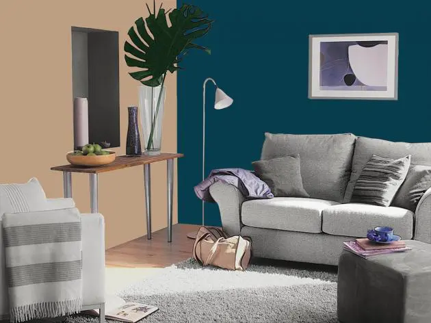
The muted teal, says Van Gent, is versatile and works well in different colour combinations. Sitting opposite coral on the colour wheel, it melds beautifully with delicate pinkish tones and warm ochre yellow and can also be combined with other tones of teal, green or blue to create a tone-on-tone effect.
Layering teal with indigo, denim or navy provides an oceanic feeling, cool, dynamic and welcoming. Combining it with greens such as mint, duck egg or emerald will give a fresh natural effect; while for a more neutral combination, a colour with a natural wood tone should be chosen. Deeper and more sophisticated than turquoise, teal is also a perfect partner to glass, concrete, steel and wood.
“Our customers always want to know what the most popular colour will be in the year to come. We don’t invent trends but we do listen to and look at what is going on in industrial design, interior, architecture and fashion. We then can see the commonalities. Teal is popping up in different fields. Indigo was the 2013 colour and teal is still part of that same palette. But while indigo is about playing safe, teal is a bit more optimistic and energetic,” says Rowe.
The economic situation also has some influence on the colour trends.
“When the economy is good, people tend to use happy colours like red and yellow. When the economic falls down, they tend to use a little bit subdued tones like grey and blue,” he says.
In addition to the colour of the year, the centre also identifies five broad colour design trends for interior and exterior decoration together with colour palettes they feel will inspire in the months ahead.
“The five trends represent the different preferences of customers but are held together by a single concept that determines what the most pivotal hue, the colour of the year, will be,” says Van Gent.
These five trends are:
Silent Revolution: This trend is very subtle, using slight shifts in hue and tone to create delicate combinations of tinted white and neutral mid tones. This palette gives a restful and silent effect that showcases the trend’s use of texture and natural materials. Think of fluffy clouds and the soft variations of shade in arctic furs.
Urban Folk: The palette is alive with friendly and robust shades that feel familiar, yet at the same time look new. Combine similar shades for a harmonious story like plum, damson and burgundy and then add a surprise contrast of ochre or light petrol blue to create something more personal. The colours are inspired by folkloric designs of a cross-stitch pattern, a bright ornamentation of Russian dolls, and sumptuous fabrics of India, South America and China.
Margin of Proof: This colour scheme is inspired by how we map our fast-paced lives. The sophisticated tones of putty, plaster and brick should provide the largest proportion the colour scheme and then be enriched with full bodied deeps like darkest emerald or oxblood. The brightest accents of bright teal, scarlet and ochre are a small but important touch as they add the graphical edge.
Secret Garden: This look is romantic, poetic and curious, with misty shades adding a subtle veil of surprise to create a feminine, yet enigmatic effect. It is filled with soft, smoky tones of green and lilac. Florals are the motif that underpins this trend, not bright frothy blooms, but rather delicate fragmented or blurred designs, which are open to interpretation.
Do It Now!: This palette represents “get up and go for it!” This is a high-octane, energetic medley of colours where anything goes. Clash and contrast or combine and blend to create a riot of colours, where there is something for everyone. Fizzy lemon and intense teal rub shoulders with bright emerald green, lime, violet and fiery orange.
