
Happiness in shades of gold


Play
Move over copper, Akzonobel says gold is the trendiest hue for 2016
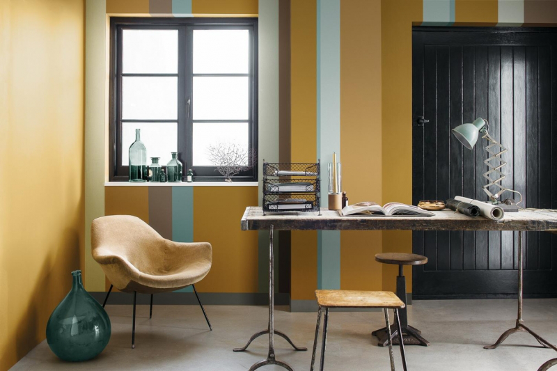
COPPER ORANGE might have been the trendiest hue of this year but paint maker AkzoNobel says monarch gold will play an important role next year in architecture, fashion, beauty and interior decorating.
As part of its 13th annual colour trend guide, the firm says the shade is bright enough to attract attention while also subtly referring to the past and the colour of the earth, combining well with other tones.
“It’s the ‘golden hour’ of dark and light; it’s the gold that appears in the paintings of both old masters [heritage] and modern artists [future] – the fusion of our past, our present and our future,” the company states.
This is the result of the on-going study about global design trends by AkzoNobel, known as ColourFutures. Every year, AkzoNobel’s Global Aesthetic Centre brings together the Analogue Group, a gathering of external influential design and colour experts to discuss what they believe will be the major developments in the coming years, based on global social and design trends.
Representing a broad cross-section of this world, these experts are able to draw on a multitude of sources, from fine art to technology, design to nature, architecture to fashion, and music to popular culture, to provide the design industry with insights on the cutting edge trends for the following year.
Examples of decorations are also seen in four main trends.
Heritage & Future
This trend lays the foundations of our identity, taking inspiration from the past, demonstrating the foundations of our identity, and gaining confidence in our steps moving forward. References from history may be contrasted with – or supported by – the modern-day; and there is a sense that by appreciating one’s history, we cultivate values and become more fully prepared for designing the future. Translated into a colour palette, reds can reflect a rich heritage, but a bright contemporary can point to the future.
Words & Pictures
The trend for words can also be seen in the use of lettering in interior design and architecture; but rather than words and images being in opposition, one complements the other. The corresponding colour palettes use the blue of ink and grey of graphite in contrast to tones familiar with smartphone and social media filters.
Dark & Light
We have long been obsessed with light, but now realise we also need the dark for a healthy, well-rested life. Research has shown how important it is not only to have a restful sleep, but also to recharge and regroup without the disrupting influence of light. Just as we need darkness in order to see the stars in the night sky more clearly, the Dutch masters of the 17th century showed how their techniques at capturing lustre and the play of light was best portrayed in contrast to dark hues. Many of the colours in this palette blend seamlessly together, recalling the tones of both dusk and dawn.
The Grid & Letting Go
We are increasingly seeing the appeal of going “off grid” in order to find oneself in the modern world. But it’s impossible to talk of going back to the wild and living offline without a frame of reference. We need boundaries within which to live, even if we seek to rebel against them; freedom is only understandable within the context of a framework. Hence the colours in this palette are vivid and playful, yet still held back by the black and white of the grid.
COLOUR ME GOLD
>>Find out more at www.Dulux.co.th/colourfutures2016
